Tips For Matching Floor Colors To Your Overall Design Scheme
Your floors look great in isolation and terrible with everything else in the room. Color matching across elements is tricky. Get it wrong, and individual pieces that look fine separately create visual chaos together. Getting floor color right means thinking about the complete room, not just the floor itself in isolation.
1. Start With Fixed Elements You Can’t Change
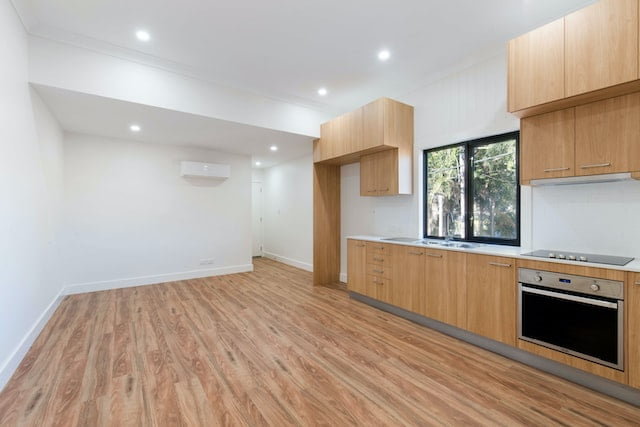
Cabinets, countertops, built ins. These fixed elements aren’t changing. Your floor needs to work with them, not fight them. Identify undertones in fixed elements and choose flooring that complements those tones instead of clashing.
Cool gray cabinets look terrible with warm orange-toned wood floors. The undertones fight each other creating visual discord. Matching undertone temperature between fixed elements and flooring creates harmony even when specific colors differ substantially.
2. Consider Lighting Conditions In The Actual Space
That floor sample looked perfect in the showroom under their lighting. Your room has completely different lighting conditions. Natural light, artificial light, and the direction of windows. These factors change how colors appear dramatically. View wood flooring collections in your actual space under your actual lighting before committing.
Colors shift based on light. What looks warm and inviting under showroom lights might look muddy and dark in your north-facing room. What looks beautifully light in bright showroom conditions might look washed out in your space. Test samples in real conditions before deciding.
3. Decide If Floors Should Blend Or Contrast
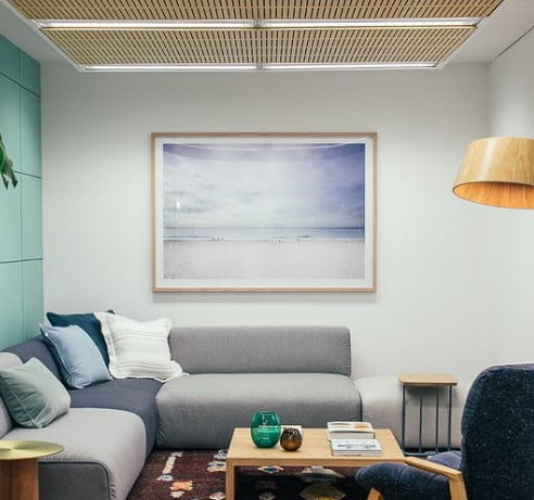
Floors close in color to walls and furniture create cohesive blended looks where rooms feel unified. Floors contrasting sharply with other elements create drama and visual interest through contrast. Neither approach is wrong, but you need to choose intentionally.
Blended approaches work well for making small spaces feel larger and calmer. Contrasting approaches work for creating visual interest in larger spaces that can handle drama. Know which effect you want and choose floor color accordingly instead of accidentally ending up with results you didn’t intend.
4. Account For How Colors Age And Wear
Some wood tones darken with age and light exposure. Others fade. Colors that look perfect initially might look completely different in five years. Understand how your chosen flooring ages before committing to it as a permanent element in your design scheme.
This matters especially for dramatic color choices. That really dark floor might be perfect now, but if it fades significantly over time, your entire color scheme falls apart. Choose colors that age gracefully with your overall design instead of requiring a complete redesign as the flooring changes appearance.
Conclusion
Floor color matching requires thinking systematically about fixed elements, actual lighting conditions, whether you want blending or contrast, and how colors age over time. Floors exist as part of complete rooms, not as isolated elements. Colors that work beautifully in isolation create disasters when combined with everything else in spaces.
Test samples in real conditions, consider undertones, make intentional decisions about blending versus contrast, and account for how aging affects appearance. Successful color coordination comes from comprehensive thinking about complete spaces, not just picking what looks nice in showroom samples.